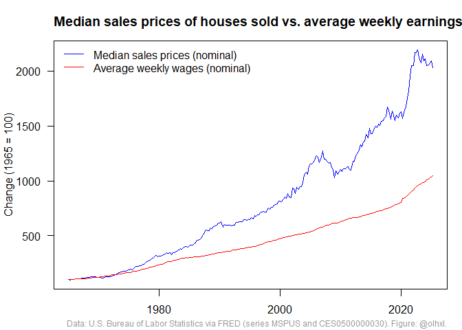
Bernie put his foot in it with this tweet:
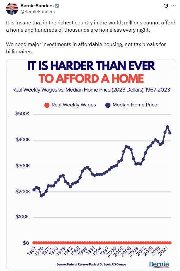
The y-axis in Bernie’s figure is appropriate for house prices but not weekly earnings. Any plausible change in weekly earnings would be compressed into a tiny part of the bottom.
The short of it
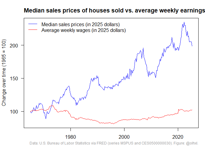
What he should have used is this figure:
Another way to look at this is to ask “how many weeks of earnings does it take to buy an ‘average’ house?”
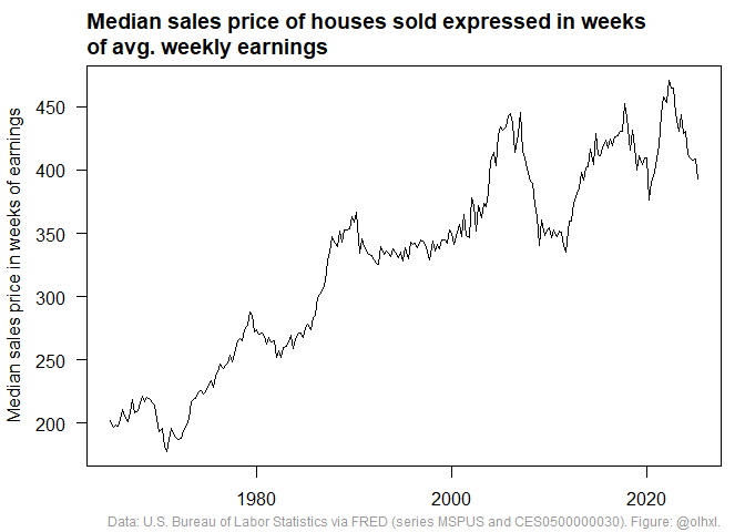
Sixty years ago, the median house cost about four years of earnings and now it costs between eight and nine years.
Of course, 2025 houses are not the same as 1965 houses. In 1965, Jack and Jill were happy to call a one-bedroom shoebox their own. In 2025, their grandchildren consider 5 bedrooms, a jacuzzi, and an avocado orchard the bare minimum.
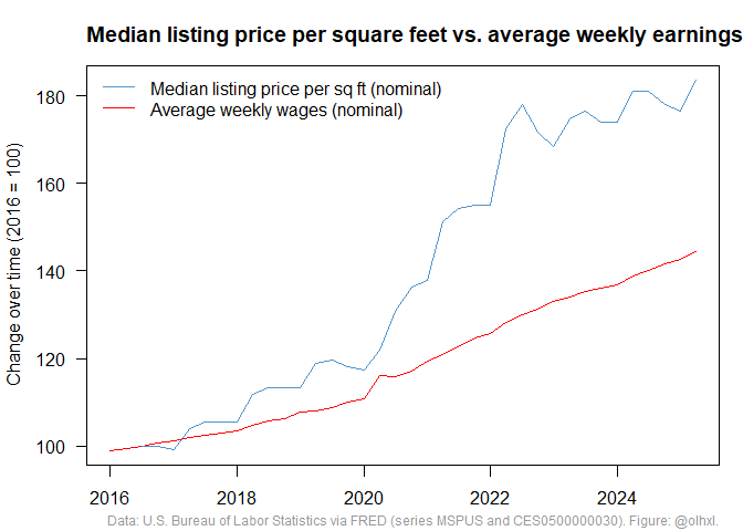
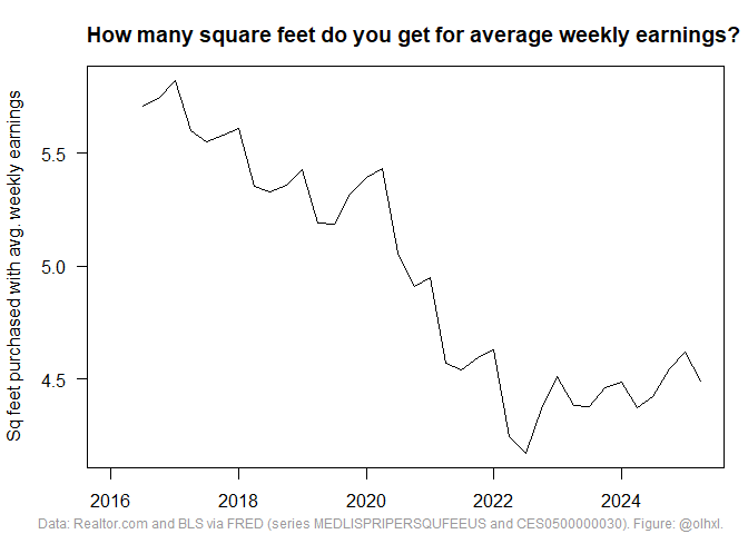
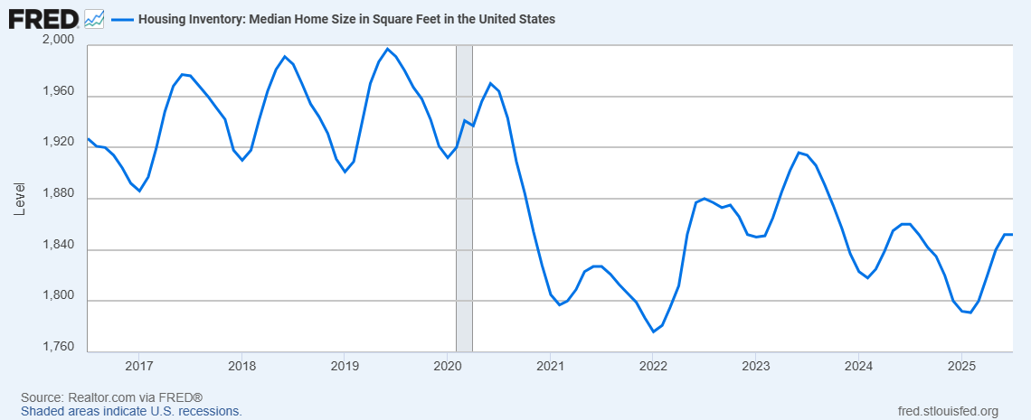
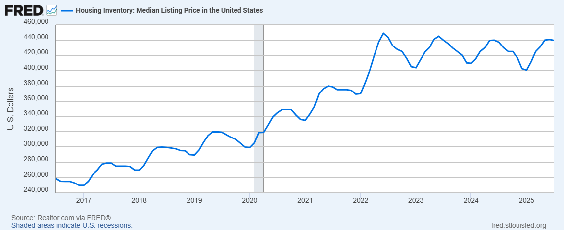
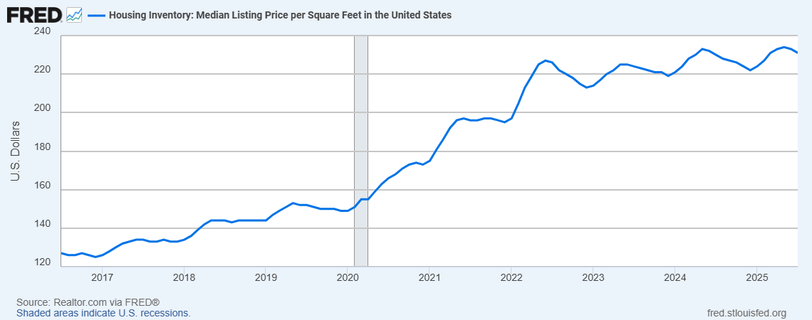
I did find some data on prices per square feet. Unfortunately, it only goes back to 2016 and shows the listing price of houses on the market instead of sales prices of houses sold. (“Housing Inventory: Median Listing Price per Square Feet in the United States” MEDLISPRIPERSQUFEEUS). I’m sure that there is a difference between the prices at which people list their houses for sale and the prices at which house sell, but I don’t know how big it is. I am also sure that some digging on IPUMS could turn up something better but that was too much work for me.
Anyway, I’m sure all this gloom and doom is only because people were happy with smaller houses sixty years ago and if we just revised our expectations, we would see how much better we’re off.
The long of it
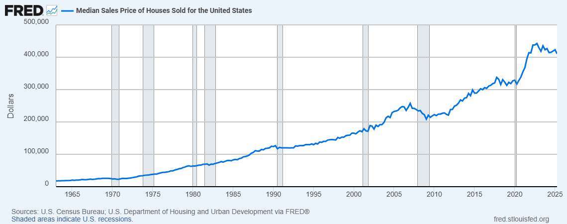
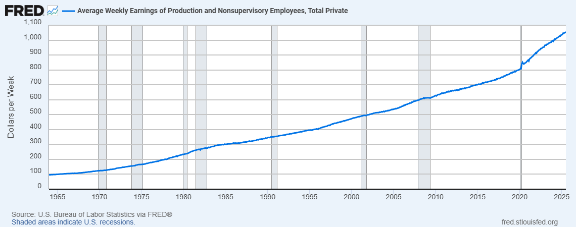
I looked through FRED for wages and house prices and I think the time series in Bernie’s figure are “Average Weekly Earnings of Production and Nonsupervisory Employees, Total Private” CES0500000030) and “Median Sales Price of Houses Sold for the United States” (MSPUS). If we just look at FRED figures, it’s hard to see anything informative. And, no, houses did not cost $0 before 1965. The first observation is $17,800 for Q1 1963.
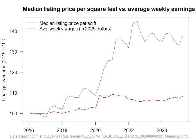
As mentioned above, we would prefer to compare earnings to prices per square feet. During the period 2016-2025, the latter rose faster than the former and you now get an entire square foot less for a week’s earnings.
Looking at some FRED time series, it seems that something happened in 2020. Listed houses are on average 100 feet (5%) smaller after 2020 but prices did not drop proportionately.
FRED series:
- Housing Inventory: Median Home Size in Square Feet in the United States MEDSQUFEEUS
- Housing Inventory: Median Listing Price in the United States MEDLISPRIUS
- Housing Inventory: Median Listing Price per Square Feet in the United States MEDLISPRIPERSQUFEEUS
To disinflate or not to disinflate
The FRED series on sales prices and weekly earnings are in nominal dollars, but people on the internet love adjusting for inflation. I don’t think it matters in this case. If we take the ratio of prices to earnings, “disinflating” (i.e. dividing by CPI) cancels out. If we compare each quantity to itself over time, it also shouldn’t matter.
However, I am not sure how consumer price indices are constructed exactly. If housing is weighted differently over time, then dividing by CPI might matter. If housing became really cheap or expensive compared to food, gas, or Trump Coins, and this influences the CPI multipliers for different years, I would argue that we should prefer nominal amounts since the relationship between prices and earnings and how it changed over time is what we want to see (and not “compensate for” by dividing by some other factor).
But everybody always adjusts for inflation so I do too. I use the “Consumer Price Index for All Urban Consumers: All Items in U.S. City Average” (CPIAUCSL) because that’s what everybody seems to be using and the Bureau of Labor Statistics says that it covers 90% of the U.S. population.
Nominal figures
I think that there is an argument for using nominal Dollar amounts, so I redid all the figures.
I guess this looks slightly less bad although it still means that house prices increased by a factor of 20 compared to 1965 whereas earnings increased by a factor of 10.